Why Familiar Screen Symbols Still Work in Entertainment Design
Why are familiar screen symbols so effective in entertainment design?
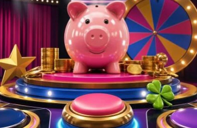
There’s a particular sort of pause that television has taught us to recognise. A host looks towards the camera. The music tightens. A brightly lit object sits just out of reach, waiting to be opened, spun, chosen or revealed.
We know the feeling before anything has happened.
That simple bit of screen language has travelled remarkably well, from classic game shows and glossy television contests to film scenes, music videos and the compact worlds of mobile games.
At the centre of it all is a familiar collection of images: gleaming coins, oversized buttons, lucky symbols, spinning wheels and, of course, the cheerful piggy bank.
It isn’t really about money in a literal sense. On screen, the piggy bank is a shortcut for possibility, playfulness and the promise that something is about to be uncovered. It’s an instantly readable prop, even when it appears for only a second.
The reveal is still one of television’s favourite tricks
Game shows have always understood the value of making an audience wait.
Think of the way a contestant’s answer is held for a beat, or how a camera cuts between a host, a scoreboard and a row of expectant faces. The reveal may only last a few seconds, yet it gets carefully built up through sound, editing and reaction shots. There’s a reason people remember those moments long after they’ve forgotten the exact question.
A reveal works because it invites viewers to join in. You might guess what’s behind the board, pick a door from the sofa or quietly decide which envelope you’d open. It’s a small act of participation, and it doesn’t require a complicated plot.
That rhythm appears far beyond studio entertainment. Films use it when a character opens a letter or lifts the lid of a box. Music videos use close-ups, glittering props and sudden cuts to punctuate a chorus. Even short online clips lean on the same structure: set-up, pause, reveal.
The ingredients are familiar:
● A clear object of focus
● A moment of uncertainty
● Sound that signals a change is coming
● A reaction that gives the moment context
● A visual payoff, often bright, colourful or deliberately over-the-top
It’s old-fashioned showmanship, really. And it still works because the audience understands the rules straight away.
Why game-show pacing feels so watchable
The best game-show moments are rarely rushed. They know when to hold back.
A host might lower their voice. The studio audience goes quiet, then responds in a burst. A simple sound effect, perhaps a rising note or a crisp bell, does more storytelling than a paragraph of explanation could manage. You don’t need to know every rule to understand that the next few seconds matter.
This is part of what makes game-show design so enduring. It deals in visual clarity. Numbers are large, colours are bold and choices are placed front and centre. The viewer never has to hunt for the important thing.
The format also makes room for human reactions. A raised eyebrow, a laugh from the crowd, somebody covering their face for a second, these little details give the screen its warmth. They make the outcome feel shared rather than remote.
There’s a useful lesson here for any kind of entertainment design: people enjoy being able to read a moment quickly. If a screen is too busy or a story is too obscure, the connection fades. But a bright button, a recognisable sound and a well-timed pause? Those can do a surprising amount of work.
For a deeper look at how television formats shape what we watch, the British Film Institute’s television resources are a worthwhile place to start.
The piggy bank: a tiny symbol with a big screen presence
Piggy banks have been around for generations, which is probably why they feel so immediately familiar. They appear in all sorts of visual worlds, from a ceramic ornament on a shelf to a giant, animated mascot designed to catch the eye.
On screen, though, the piggy bank is less about saving strategy and more about character. It’s round, friendly and a bit silly. It can be shiny, striped, dressed in a bow tie or pictured beside stars and lucky charms. A plain coin is just a coin. Put it next to a smiling piggy bank, and suddenly it belongs to a little story.
That storytelling shorthand appears in pop culture again and again:
● Lucky charms suggest a moment of chance or a hopeful choice.
● Coins and treasure chests signal discovery and a coming reveal.
● Stars, bells and bright ribbons add celebration without needing dialogue.
● Cartoonish prize imagery makes a scene feel light-hearted and exaggerated.
The point is familiarity. These symbols are easy to understand at a glance, which matters when an advert, title sequence or mobile screen only has a moment to make an impression.
I find there’s something comforting in their simplicity, too. They belong to the same visual family as fairground signs, quiz-show buzzers and old-fashioned arcade lights. You don’t need a long backstory to get the mood.
From studio lights to the screen in your hand
Contemporary casual games borrow heavily from the visual language of television. That makes sense: both need to communicate quickly, keep the action legible and give the user something satisfying to look at.
On a phone screen, space is limited. Designers often use a strong central theme, high-contrast colour and short animations to make the experience easy to follow. A character might bounce when a button is selected. Symbols may shimmer, spin or pop into view. Sound cues help mark a change, much as they do on television.
It’s not a new idea, but mobile design has made it more concentrated. Where a game show has a full studio, a presenter and an audience, a mobile game has only a few seconds and a few inches of screen space. It needs visual shorthand.
That’s where piggy-bank imagery remains useful. Its rounded shape reads well at small sizes, while its associations with coins, luck and playful suspense fit naturally alongside colourful, game-show-inspired graphics. It offers an immediate theme without asking the player to learn an elaborate fictional world.
Colour plays its part as well. Gold tones suggest a theatrical spotlight. Pink feels friendly and distinctive. Greens, blues and purples can make the screen feel energetic without losing clarity. When these choices are paired with neat animation and uncomplicated iconography, the result feels familiar almost immediately.
One contemporary example of the familiar piggy-bank visual trope is Double Bubble’s Big Piggy Bank online slot.
Familiar symbols, fresh formats
There’s no mystery behind the staying power of piggy-bank play. It works because it relies on images we already understand. The object is recognisable, the tone is playful and the structure echoes decades of screen entertainment built around a well-timed reveal.
Whether it’s a studio contestant waiting for a panel to turn, a film character opening a locked case or a colourful mobile screen using bright symbols and short bursts of animation, the basic appeal is much the same. We like a clear set-up. We enjoy the pause. And we notice a visual payoff when it arrives.
The piggy bank simply remains one of the most cheerful ways to frame that moment.
18+ Responsible Play
This sponsored reference is intended for adults aged 18 and over only. If you choose to gamble, keep it recreational, set personal limits and seek support from organisations such as GamCare if you need it.